
WNBA unveils new jerseys: Which teams nailed it and which fell short?
A week before the 2021 WNBA Draft, the league unveiled three new uniforms for each of its 12 franchises ahead of its upcoming 25th-anniversary season.
Capitalizing on the momentum it built in the “Wubble” at the end of the 2020 season, the WNBA collaborated with Nike to simultaneously capture the spirits of each city and use the league’s platform to tell stories of historic female figures.
“The new #WNBA uniform system from Nike features three game uniform editions for each of the 12 teams in the league, bringing stories from their cities and communities to life through the muse of female archetypes in storytelling and film,” the WNBA wrote in its announcement on Twitter.
Every uniform set includes a “Heroine” Edition, an “Explorer” Edition, and a “Rebel” Edition, spelling out “H.E.R.” when factored in together.
Overall, each of the 12 franchises succeeded when it came to bringing attention to certain messages and stories, with teams like the New York Liberty utilizing their jerseys to promote “EQUALITY” and the Dallas Wings honoring the P-40 Warhawk, a plane from World War II that was test-flown by Women Airforce Service Pilots.
But, while there weren’t any flaws with the messages themselves, the physical execution of the jerseys was hit-or-miss.
>>RELATED: NBA 2K21 adding WNBA-centered game modes is a huge ‘W’
Some teams crafted picture-perfect uniforms for their players to wear throughout the WNBA’s 25th season. Others, however, left something to be desired with their final products.
After taking some time to digest each of the league’s new uniforms, we broke down, in no particular order, the teams that “nailed it” and the franchises that “fell short” in their efforts.
Nailed It:
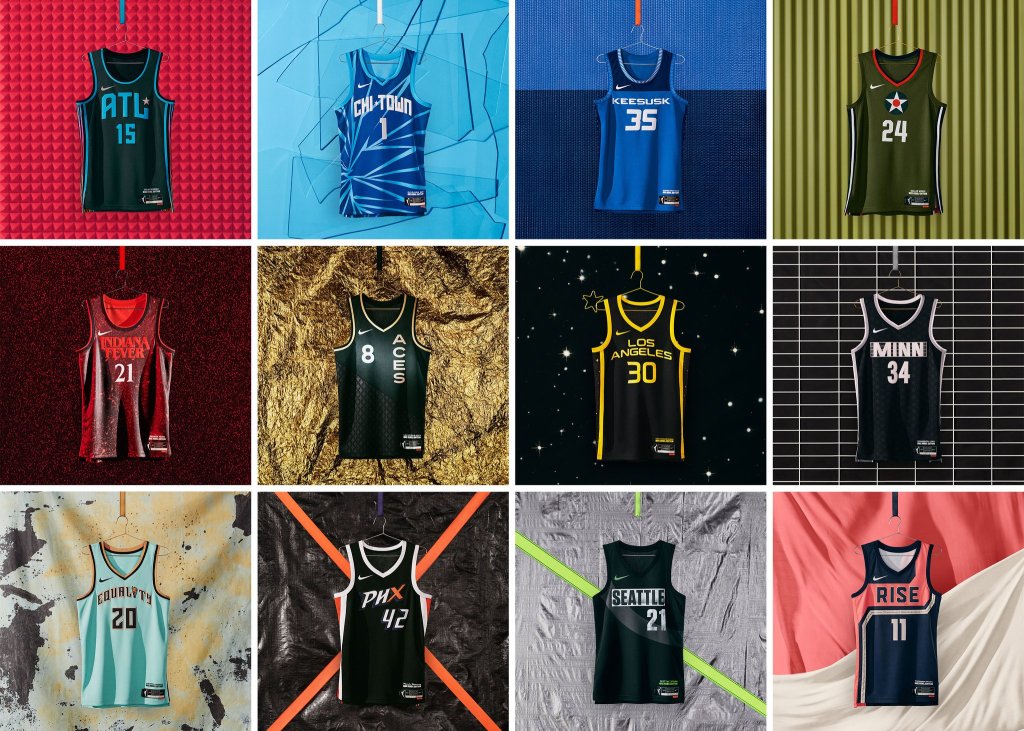
- Atlanta Dream
Atlanta basketball teams have a history of success when it comes time to make a city-themed jersey, so it’s no surprise that the Atlanta Dream would come in strong with their Heroine, Explorer, and Rebel Edition jerseys.
Paying tribute to Civil Rights march sign fonts with their “Explorer Edition” jerseys and highlighting the city’s music industry with the “Rebel Edition,” the Dream put together one of the strongest uniform sets in the entire league.
>>RELATED: Ranking the NBA’s new City Edition jerseys for the 2020-2021 season
Utilizing a variety of colors to work with and showcasing different parts of the city’s legacy, the Dream are the perfect way to kick off the “Nailed It” category.
- Chicago Sky
Arguably the best example of the purpose of the WNBA’s new uniforms, the Chicago Sky put together something special with their new jerseys for the 2021 season.
Their “Explorer Edition” jerseys give off some Chicago Bulls-esque vibes with their faded pinstripes in the Sky’s black, blue and yellow colorway.
Their “Rebel Edition” uniforms capture the intended message of women breaking through the glass ceiling, and the WNBA wrote that using “shattered lines and a cool hue” serves as a reminder to all women that nothing can stop a team of women born from the heart of the Windy City.”
All in all, it seems like Candace Parker picked the right season to head home to Chicago, and the sky truly seemed like the limit for these designs.
- Indiana Fever
This one could easily be the most hit-or-miss jersey of the bunch for WNBA fans, depending on their appreciation for the show behind the design of the team’s “Rebel Edition” jerseys.
Drawing inspiration from Netflix’s “Stranger Things,” which is set in Indiana, the “Rebel Edition” set pays tribute to the show’s main female character, Eleven, who, as the WNBA wrote, “breaks the mold by being subtle yet powerful.”
>>RELATED: The rise of NBA Top Shot as collectors pay thousands for digital highlights
The jerseys are very reminiscent of the bold designs the Brooklyn Nets and Los Angeles Clippers use in the NBA, and could be the most polarizing of the bunch depending on whether or not you prefer simplistic designs.
Add in the tribute to the Lady Victory statue in the “Explorer Edition” and the elements from the Indiana state flag, and the Fever’s set comes across as one of the more well-rounded in the league.
- Los Angeles Sparks
Going old school for the 25th anniversary of the WNBA, the Los Angeles Sparks put together one of the best “Explorer Edition” uniforms to dust off a classic design from the Lisa Leslie era.
The franchise stayed consistent with the palm-tree design of the “Sparks” jerseys from the 2000s, but rolled with “Los Angeles” for the font on the front of the modern uniforms.
For the “Rebel Edition” uniforms, the WNBA said the team honored “the energy, brilliance, and fire of those women who work every day to bring the city to life” with a jersey inspired by yellow “shining stars.”
While the “Rebel Edition” jersey design may seem bland in comparison, the “Explorer Edition” transcends the Sparks’ uniforms from alright to great ahead of the 2021 season.
- New York Liberty
One of two teams to roll with a phrase on the front of their “Rebel Edition” uniforms instead of a team name, the New York Liberty come out strong with their entire set for 2021.
Their logo works perfectly for what the league was trying to get across, and using the torch from the “Statue of Liberty” as part of the font for two of the three jerseys works wonders for New York.
>>RELATED: Spurs coach Becky Hammon’s monumental moment is a long time coming
While the torch as the “i” in “Liberty” looks great for the “Heroine Edition” uniforms, the “Rebel Edition” jerseys featuring the word “Equality” on the front with one of America’s oldest landmarks in the mix creates both a powerful message and an appealing design.
Outside of the team’s font, there isn’t much to complain about when looking at the Liberty’s set.
- Phoenix Mercury
Similar to Atlanta, Phoenix basketball teams know what to do when they collaborate with Nike.
The sponsorship placement brings things down a few notches, but the gradient design of the “Explorer Edition” jerseys, aligned with the tribute to the team’s fanbase with their X-Factor-inspired “Rebel Edition” jerseys, makes up for it.
The messaging isn’t as inspired by a specific element of history, but paying tribute to Phoenix makes the Mercury’s jerseys feel like the WNBA equivalent of the fan-favorite “City Edition” uniforms from the NBA.
Their colors and fonts just work so well together and the designs are solid, so Phoenix seems like an easy fit for this category.
- Seattle Storm
This list is in alphabetical order, but if we had to give one franchise the gold medal for this endeavor, it would be the Seattle Storm.
Their “Explorer” jerseys give off some serious Seattle SuperSonics vibes, hitting fans right in the feels as the city continues their pursuit for an NBA franchise in the 2020s.
But, their “Rebel Edition” uniforms may be one of the strongest in the entire league.
>>RELATED: Welcome to Seattle, the United States’ next major sports city
It’s subtle enough to not bother fans, like the Indiana Fever’s “Stranger Things” jerseys might. But, the jersey’s grunge-esque, worn-looking design on the front, coupled with the “sash-like swoop across the chest and back symbolizing female empowerment,” is both powerful and visually appealing.
If the phrase, “Look good, feel good, play good,” rings true, it wouldn’t be surprising to see the Storm back atop the WNBA for the second year in a row when the dust clears in 2021.
- Washington Mystics
Disney World-looking font on the “Heroine” and “Explorer” jerseys aside, the Washington Mystics’ mix of simplistic designs and powerful messaging keeps them in the “Nailed It” category.
Per the WNBA, the “Rebel Edition” uniform “elevates and supports Women’s March’s fight for women’s rights both nationwide and beyond.”
Rolling with a similar approach as the Atlanta Hawks utilized for their “MLK” jerseys for 2021, the Mystics feature ‘RISE’ on the front of their “Rebel Edition” to honor the “rallying cry to stand up for women’s rights.”
The “H” and “E” parts of the “H.E.R.” set could use some work, but the “R” piece certainly makes up for the basic designs.
Fell Short:
- Connecticut Sun
The Connecticut Sun honored the tribe that owns its home arena with their “Rebel Edition” jerseys, but their new uniforms are the perfect example of wanting a little extra “pow” from the final product.
The “Heroine Edition” seems too simple, even with the design on its side, and the “Explorer Edition” is just as basic, with “Connecticut” on the front instead of “Sun.”
The “Rebel Edition” features the same simplicity, but strays from the Sun’s usual orange and white, with a blue colorway making the jerseys feel like they were better suited for the Chicago Sky and Minnesota Lynx.
Overall, it was just a miss for the Sun, and Connecticut feels like the perfect example to kick off the “Fell Short” category.
- Dallas Wings
Right off the bat, it’s important to point out that the Dallas Wings put together one of the best uniforms as it relates to honoring women’s history with their “Rebel Edition” jerseys. But, these categories factor in the whole picture, and their overall grade brings the Wings back down to Earth.
The military-inspired, World War II-honoring “Rebel Edition” uniforms are arguably the most unique in the league, and they stand out in a good way.
But, their “Heroine Edition” and “Explorer Edition” jerseys don’t seem like anything special in comparison, and the quality of the “Rebel Edition” makes the discrepancy seem much more glaring.
- Las Vegas Aces
Founded in 2018, the Las Vegas Aces don’t have much to work with as far as franchise history is concerned, so they don’t get the same opportunities as a team like the Los Angeles Sparks.
But, the return of numbers on the front of WNBA jerseys actually seems to hurt the Aces, taking away the logo that was on the front of the team’s uniforms from 2018 through 2020.
>>RELATED: NBA All-Star Game: All-Time Draft
It makes the jerseys feel too basic, and the diamond pattern on the black “Rebel Edition” jerseys is the lone city-specific element to tie into the Las Vegas theme.
It may just be a product of the franchise’s youth, and a bold reworking of the team’s look may have been out of the cards for that reason, but the simplicity just stands out in a negative way in this league-wide project.
- Minnesota Lynx
The Minnesota Lynx didn’t stray from the norm for their “Heroine Edition” and “Explorer Edition” jerseys, and their “Rebel Edition” jerseys could use a little work in the state’s attempt to honor its historic music venues.
The blue “Explorer Edition” jerseys and the white “Heroine Edition” uniforms, likely purposefully, seem a bit too similar to the Lynx’s NBA counterpart, the Timberwolves. So, it makes it seem like the Lynx don’t have their own identity.
Then, the “Rebel Edition” gives them the chance to establish that identity, but the team’s attempts at a tribute to music fall short, as well, and makes the franchise look like they’re from Brooklyn, rather than Minnesota.
Similar to the Sun, the simplicity just impacts the drop negatively, and leaves fans wanting more.
Which is your favorite out of the WNBA’s new jerseys? Let us know by following @SOTSports on Twitter or by liking our Facebook page!
Categories

6 thoughts on “WNBA unveils new jerseys: Which teams nailed it and which fell short?” Leave a comment ›